Hi all, and welcome back to rumblewrites. This week’s post is the third and final part to my post about reading medieval handwriting. If you’d like to catch up, you can read the first two posts here and here. This time, we’re all about Gothic and humanist scripts.
If you enjoy this article, do subscribe for more historical and linguistic content:
Gothic bookhands
After Caroline miniscule, we see a transition to a different kind of aesthetic, but one which was still deeply concerned with uniformity. There is also a huge increase in the number of manuscripts which survive from the 12thC onwards due to the establishment of more secular centres.
Proto-Gothic
12thC
First came proto-Gothic, the transitional script between Caroline miniscule and Gothic “proper”. Features to note include:
Lateral compression
More prominent serifs at the tops and bottoms of vertical strokes
More weight to the script
Headstroke of ‘a’ rises above the headline
littera textualis
13thC
Interesting to note that we can date this particular example t o the early 15thC, partially because of the script, but also because the ivy leaf border was a decorative feature only used from the late 14thC onwards!
This doesn’t look every so different from proto-Gothic, but you can see it becomes more concise and sharp. In particular, there is:
Increased lateral compression
Shortening of ascenders and descenders
Reduction of space between letters
Preference for ‘closed’ forms
Fusion of facing contrary curves (known as ‘biting’)
The transition to Gothic bookhands did not happen all at once. There was some regional variation:
Northern textualis
Late 12thC; England, France, Low Countries
Northern textualis was angular, with rectangular proportions. It also featured a deconstruction of curve strokes: the arches of ‘m’, ‘n’, and ‘p’ are broken at the apex, reducing the letters to straight strokes.
Southern textualis
13thC; Italy, Iberian Peninsula, Scandinavia, & central Europe
The southern variant of the textualis script took on a preference for square proportions and round letter shapes (as in Caroline miniscule). It also featured an exaggerated contrast between broad and hairline strokes.
Gothic cursive
A cursive version of the Gothic script developed during the same period, and can be differentiated by the number of pen lifts. In cursive, there are fewer, and the writing speed is greater. The aspect is not as formal, but there is still some interest in uniformity.
It can be characterised by the following features:
Stylised serif added to the left-hand side of ascenders
‘a’ with elongated head-stroke
Appearance of loops to the right of ascenders
Round ‘s’ with loop below the base line
Anglicana
13thC, England
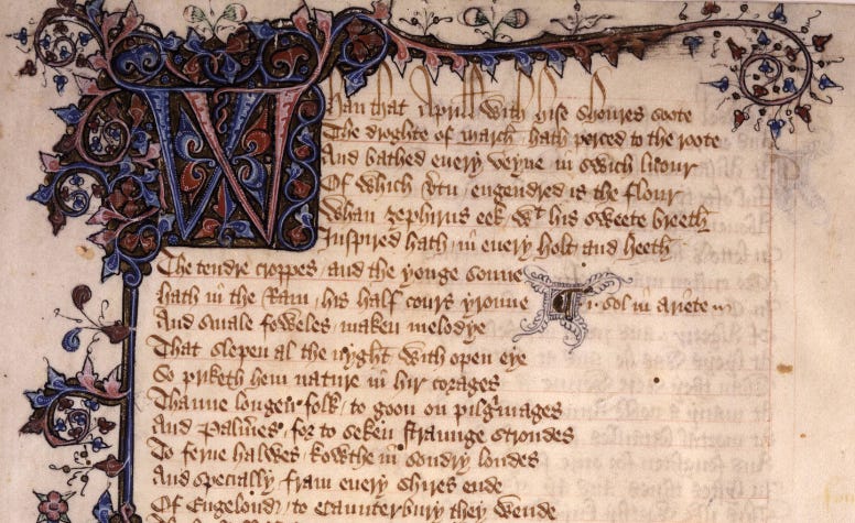
San Marino (CA), Huntington Library, MS EL 26 C 9, f.1r [ref]. Just to note, this is actually an eg of bastard Anglicana, which mixes in some textualis features (here, it’s treatment of minim strokes) with the aspect & scale of Anglicana
The earliest form of standard cursive script in Europe was Anglican. It can be identified by:
New forms of ‘a’, ‘d’, and ‘s’
Forked / looped ascenders
8-shaped ‘g’
Secretary
Late 14th, but esp 15thC, England
A little later, Secretary emerged, also in England. Defined by its:
Clear contrast of thick and thin strokes (use of angled nibs)
Forked ‘g’
Diamond shaped ‘a’
Kidney shaped ‘s’
Broken lobes of ‘d’ and ‘q’
Humanist
In the late 14thC, there was a conscious revival of Caroline miniscule as many criticised the Gothic script of becoming too stylised and difficult to read. Humanist scripts became characteristic of the 15thC and is a lot more reminiscent of modern handwriting styles. It too had both set and cursive hands.
littera antiqua
Florence (1410s) – Venice (1420s) – rest of Italy & France (1430s-) – England (1440s)
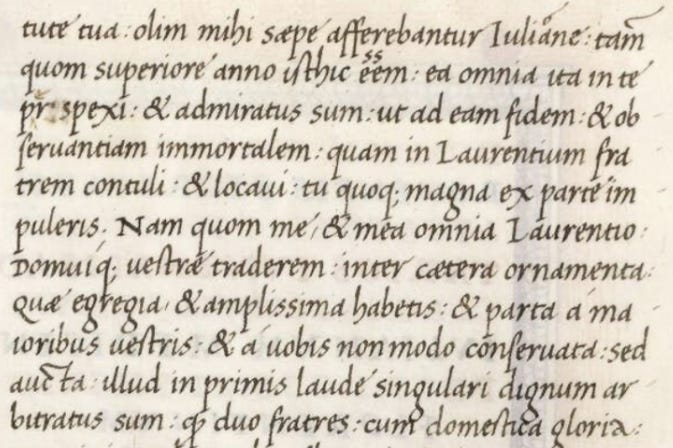
Cicero, Marcus Tullius, Opera nonnulla, Vat.lat.3245 [ref].
The set form of humanist script was littera antiqua, which made its way across Europe in the first half of the 15thC. It was characterised both by Caroline miniscule-esque letterforms, but also:
Straight back ‘d’
Tall ‘s’
‘a’ has a straight back
Far fewer abbreviations
Also, in terms of layout, the text tended to begin on the first ruled line of a page. As opposed to Gothic scripts, it was also largely written in a single column.
Cursive
14th & 15th Cs
The final script I’ll be discussing is humanist cursive. It maintains the simplicity and clarity of its set counterpart, but with joined-up letters. It also has the following distinct letter forms:
‘f’ and ‘s’ have descenders
‘g’ is formed of 2 connected ‘o’s
single compartment ‘a’


