


Deciphering medieval scripts 2
National Hands: Leuxeil, Corbie AB, Merovingian Chancery, Visigothic, Beneventan, & Insular

Hi all, and welcome back to rumblewrites. Today’s post is the 2nd in my series of articles about medieval palaeography. We’re picking right up where we left off and talking about the ‘National Hands’ which developed in different parts of Europe in the 7th-12thCs. If you want to get caught up, you can read my first post here.
The next, and final, post in the series will be coming on 25th April. Subscribe so you don’t miss it:
In general, this was a period of experimentation / fluidity in Europe when it came to handwriting. There was a great deal of locaitonal and in-script variety. It is also important to note that the scripts discussed in the previous post, specifically Caroline miniscule, Uncial, and display capitalis, continued to be used throughout this period.
Leuxeil
590-752, Frankish

This script was created by an Irish missionary who travelled to set up monasteries on the continent. It is visually similar to Merovingian Chancery (discussed below) in terms of the compression of the script and its ascenders. Features to note include:
Occasional use of uncial forms
Use of &
Two ‘c’s form an ‘a’
Flattening at the top of letters like ‘g’ and ‘h’
‘t’ tends to have a pronounced bow on the head stroke
Corbie AB
c.660-onwards, Frankish
Corbie AB developed out of the Leuxiel script and continued to exist beyond it. It was written in single columns, and had a compressed, regular aspect. Features to note include:
‘b’ look like a ‘t’
‘a’ looks like ‘ic’
Ligatures*
‘t’ often has a looped headstroke
* Ligatures are where 2 or more letters are joined together to create a single glyph, or letter shape
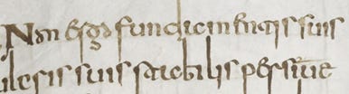
Merovingian Chancery
c.6th-9thCs (esp 7thC), Frankish

Cambridge, Corpus Christi College, MS 193: Ambrose, Hexameron f2v [ref]
This script appeared primarily in diplomatic / chancery documents as opposed to books. It had a very spidery appearance, taking inspiration from Roman cursive scripts. It actually looks quite nice in the example above, but it can appear almost incomprehensible:

I think it’s my least favourite medieval script (sorry). It does have quite a distinctive appearance, but some specific features to note:
‘d’ both ascends (tend to be extreme, esp on first line) and descends
Use of &
Spacing between words is not standardised, but random
“Ribbon” display capitals
Visigothic
8th – 12th Cs, Iberian Peninsula

Visigothic is the longest lived of all the national hands. It can be distinguished by the following features:
Clubbed heads on the ascenders
Some uncial remnants (esp ‘g’, also strict delineation between letters)
Bizarre ‘x’ and ‘z’ forms
Infrequent abbreviations
Orthographic shift between ‘v’ and ‘b’ - inconsistent spelling
Beneventan
Mid 8th - 13th Cs, Italian penninsular

This is the most popular of the scripts discussed in today’s post, and became so common-place in Italy that it can almost be seen as its offical hand.
Features to note include:
Generally round aspect
Lots of ligatures
Tall ‘e’
Squat ascenders
‘a’ and ‘d’ retain their uncial forms
‘t’ has a curved headstroke
Insular
c.650 - 850 CE, British Isles

Of all the scripts discussed today, I’d say this is the closest to the unical form we looked at last time. It retains many of its features, but with a few key changes:
Greater spacing between words
Non-standardised and more frequent use of abbreviations
‘g’ has a flat top, with a squiggle descender
Ligature of ‘nt’
And there we have it - all the so-called National Hands. Remember to come back for the final installment in this series on 25th April, when we’ll be talking about Gothic and humanist scripts.